Eames Institute
The Eames Institute, is a new non-profit organization where the lessons of Ray and Charles are brought to life for a new generation willing to explore the “boundaries of problems.”
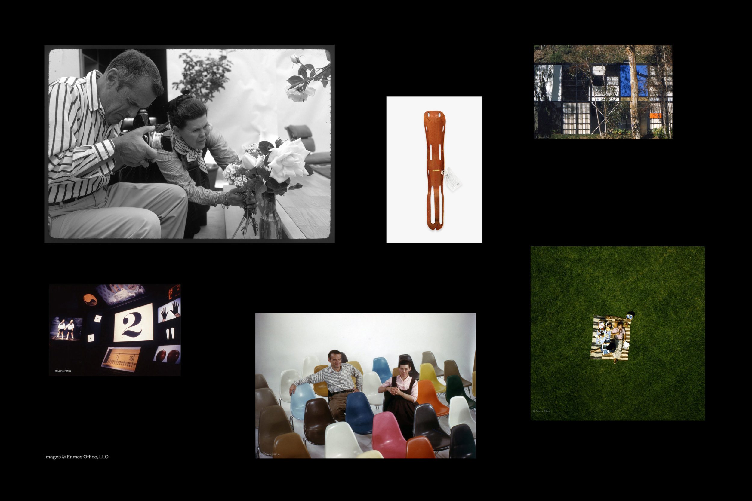
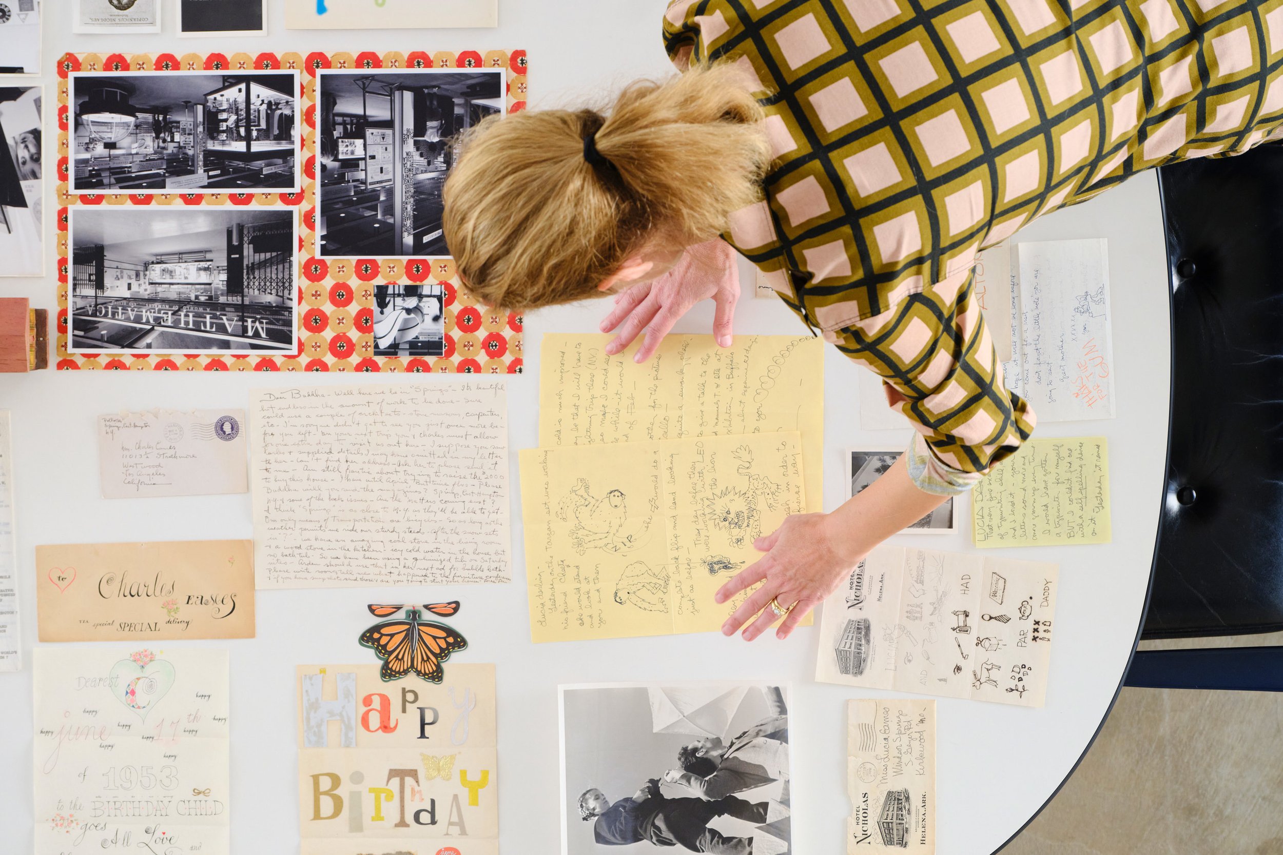
Containing thousands of artifacts, the Eames Collection is a one-of-a-kind record of the Eameses’ extraordinary partnership that encapsulates their unique methodologies and diverse interests. It offers countless examples of Ray and Charles's process, and illustrates the lessons we can take from their approach to design. The Eames Institute is responsible for stewarding this remarkable body of work, while also making it accessible to other institutions and the public at large.
The Eames Institute enlisted Manual to create a brand identity for the organization and help bring the lessons of Ray and Charles Eames to life.
DESIGNED AT MANUAL (2021)


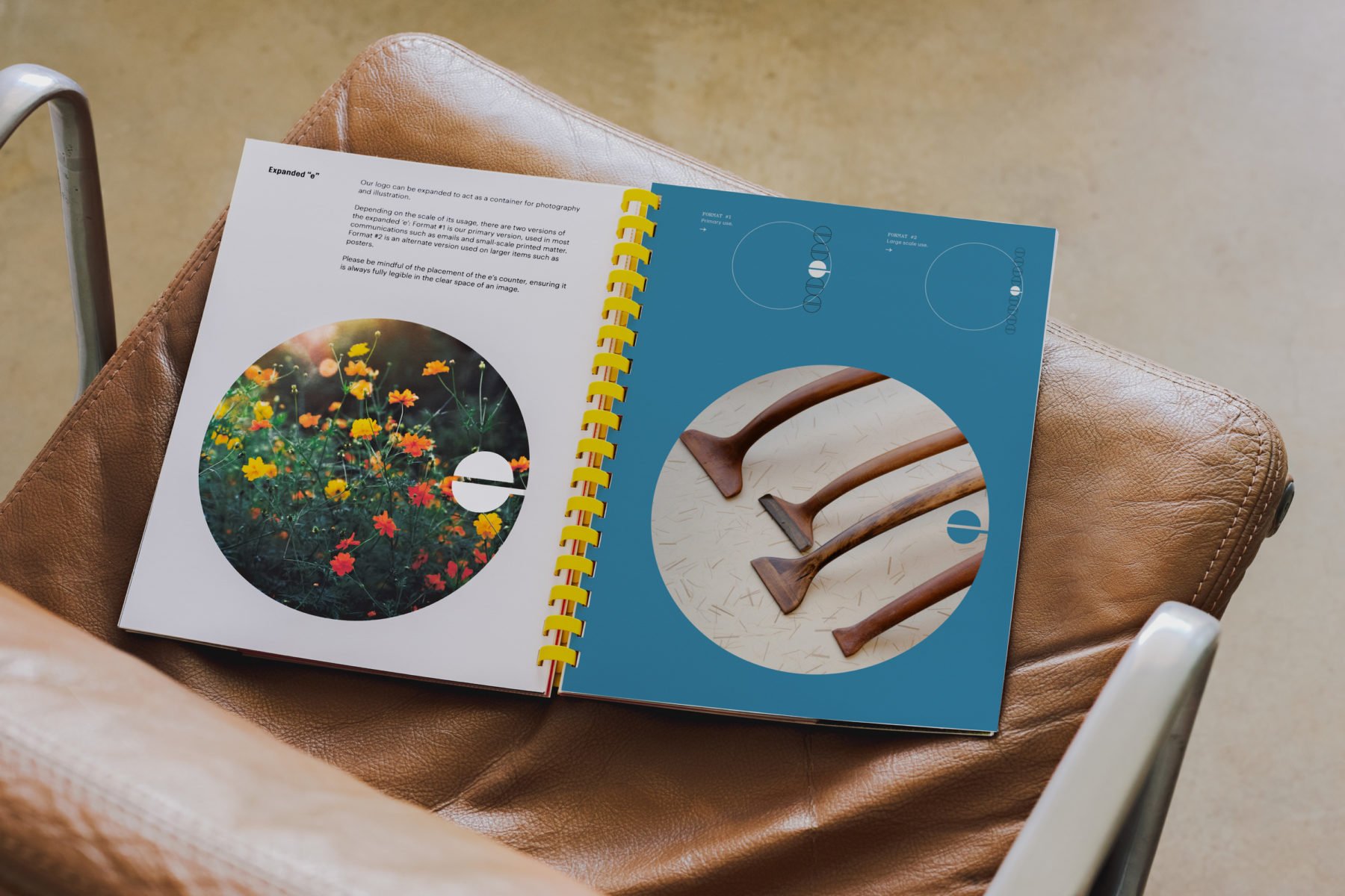
LOGO CONCEPT
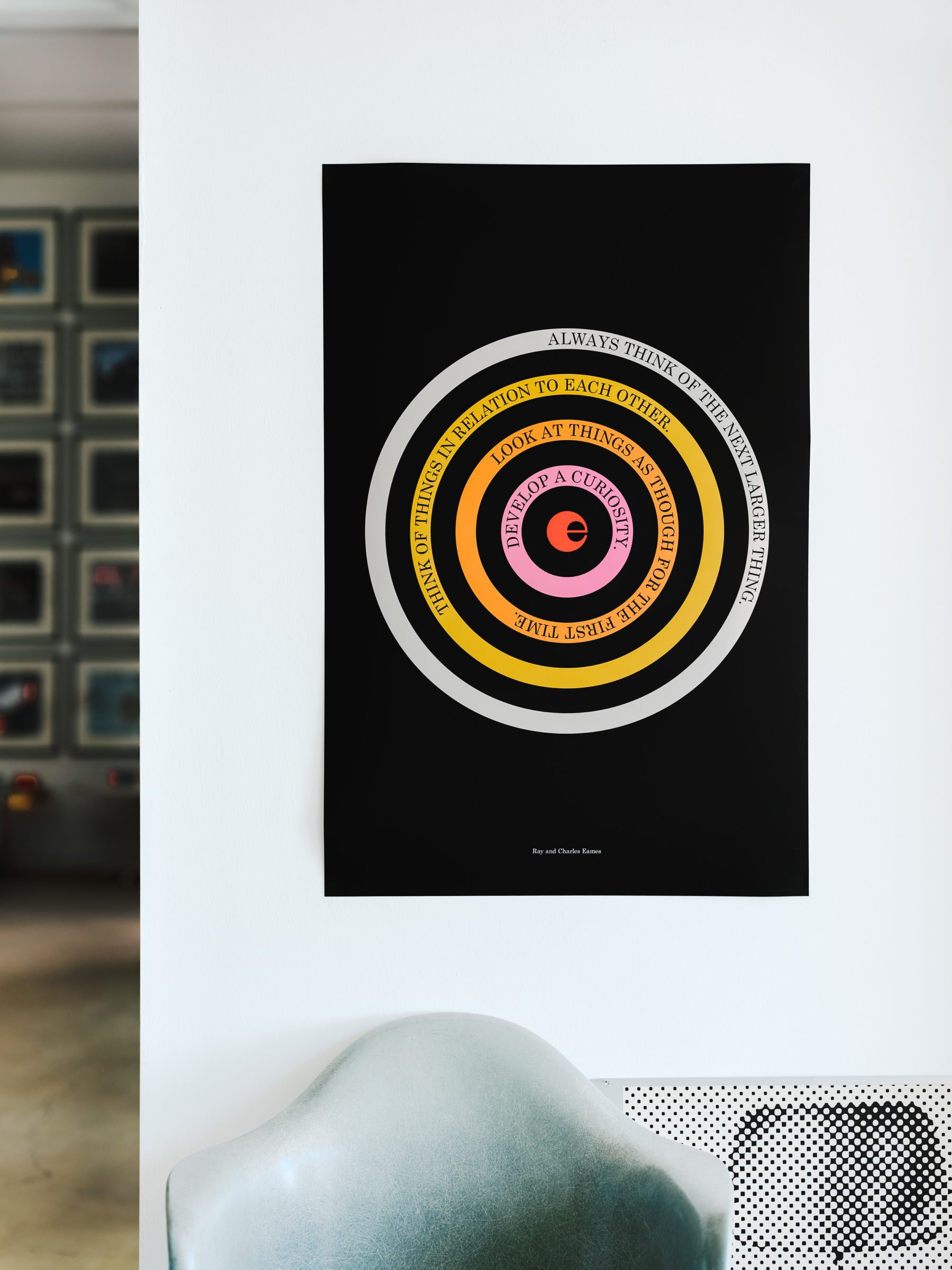
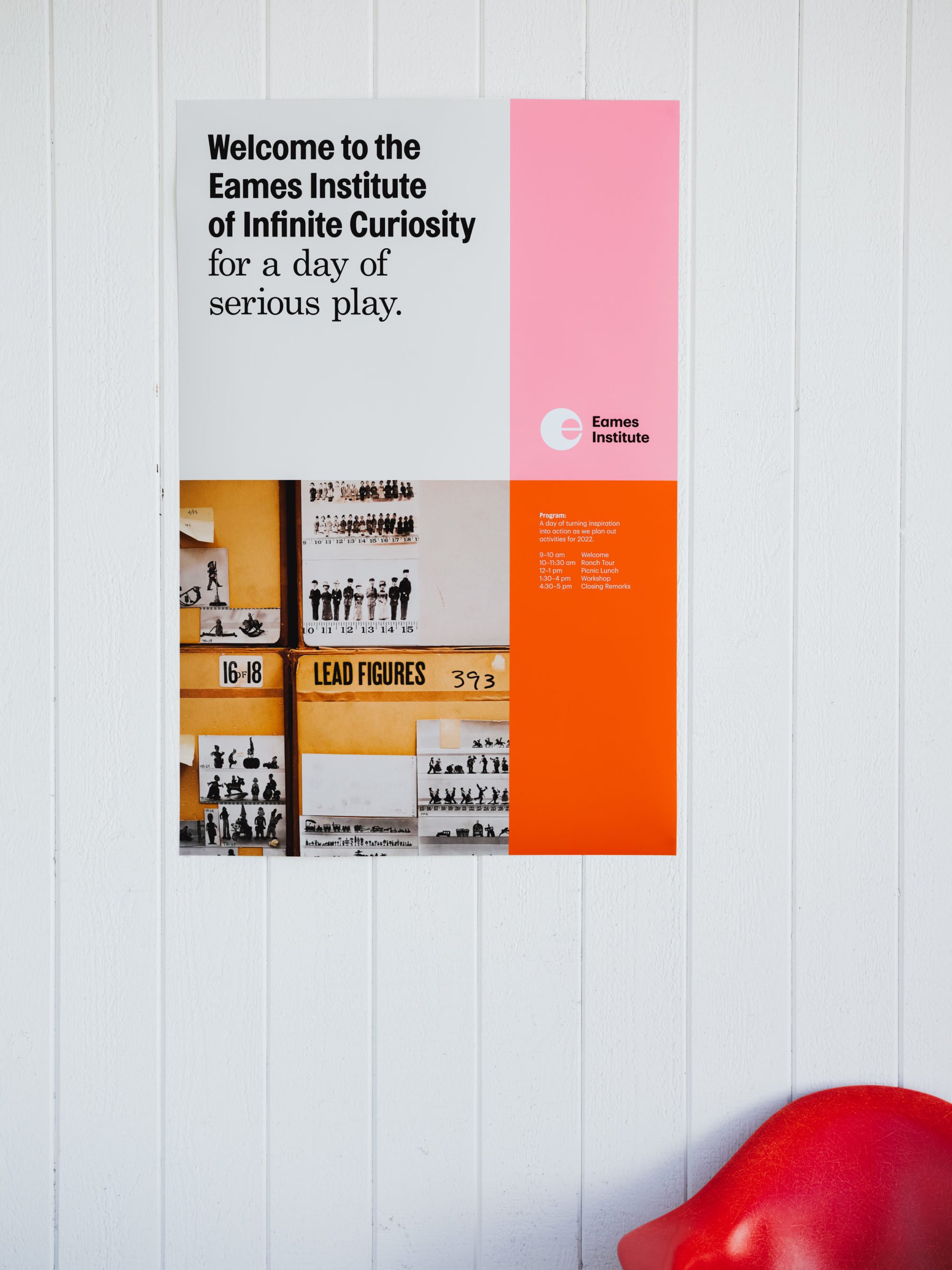
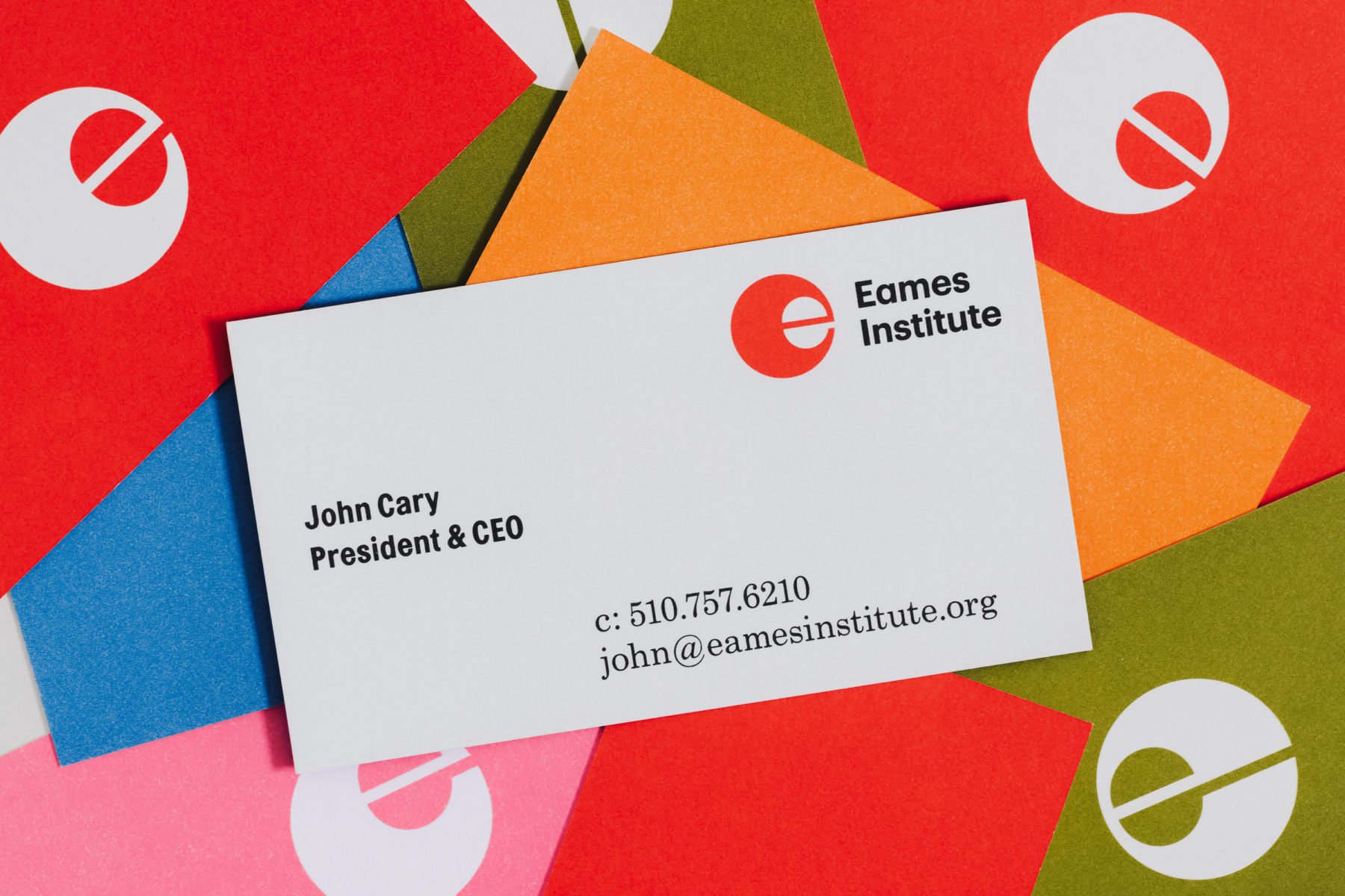
The logo is conceptually rooted in the idea of a "curious e," designed as a dynamic monogram that embodies adaptability. It can shift its gaze to observe its surroundings, highlight content, and honor the Eames' legacy of spirited exploration and discovery.


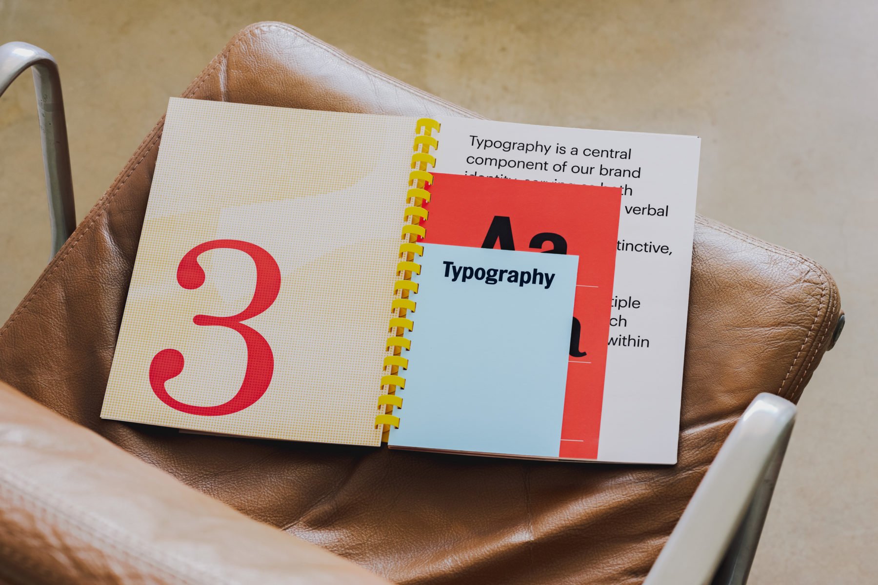

TyPOGRAPHIC VOICE
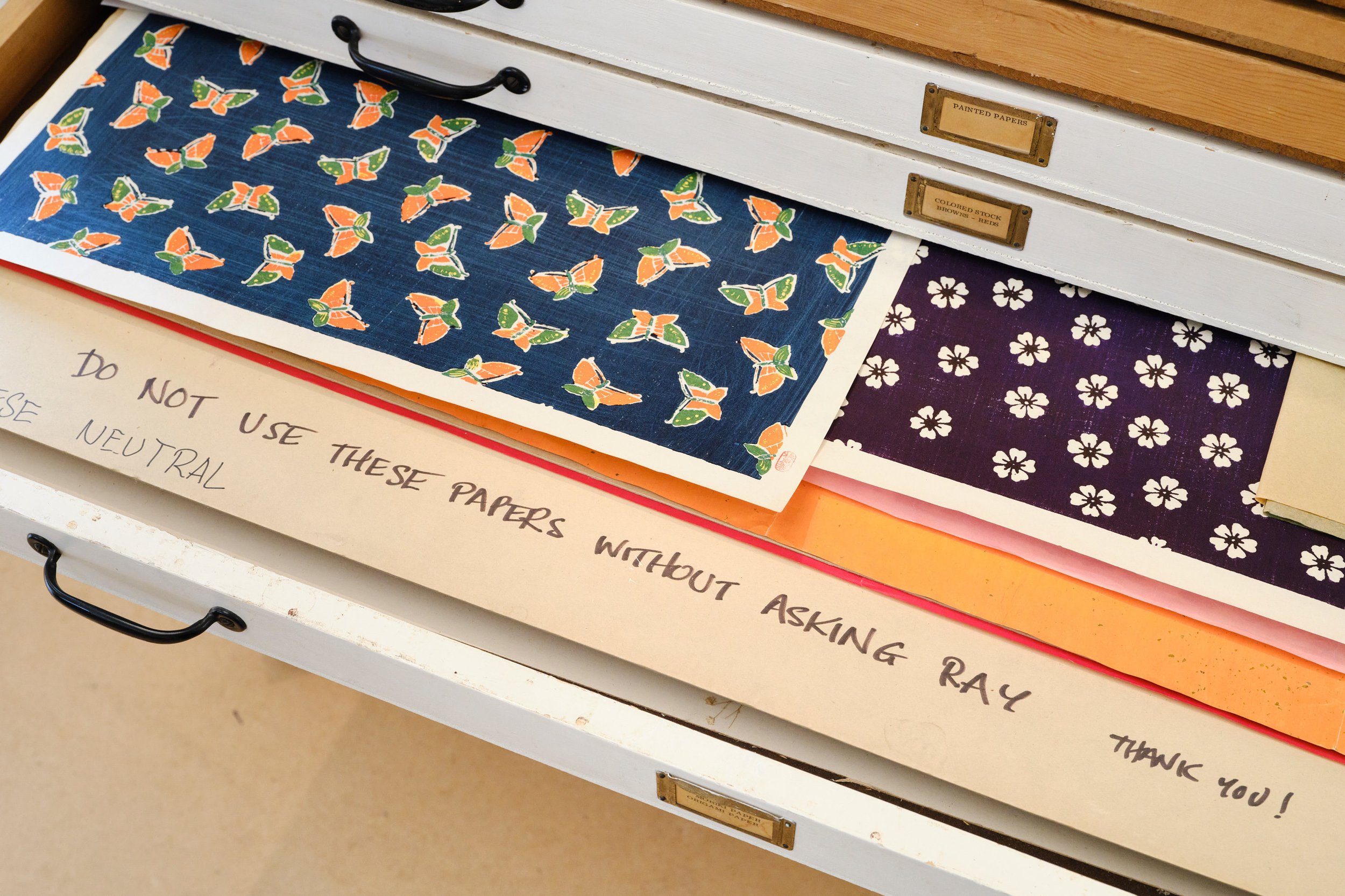
Typography choices were inspired by clues we found while looking through the archive of Eames ephemera.
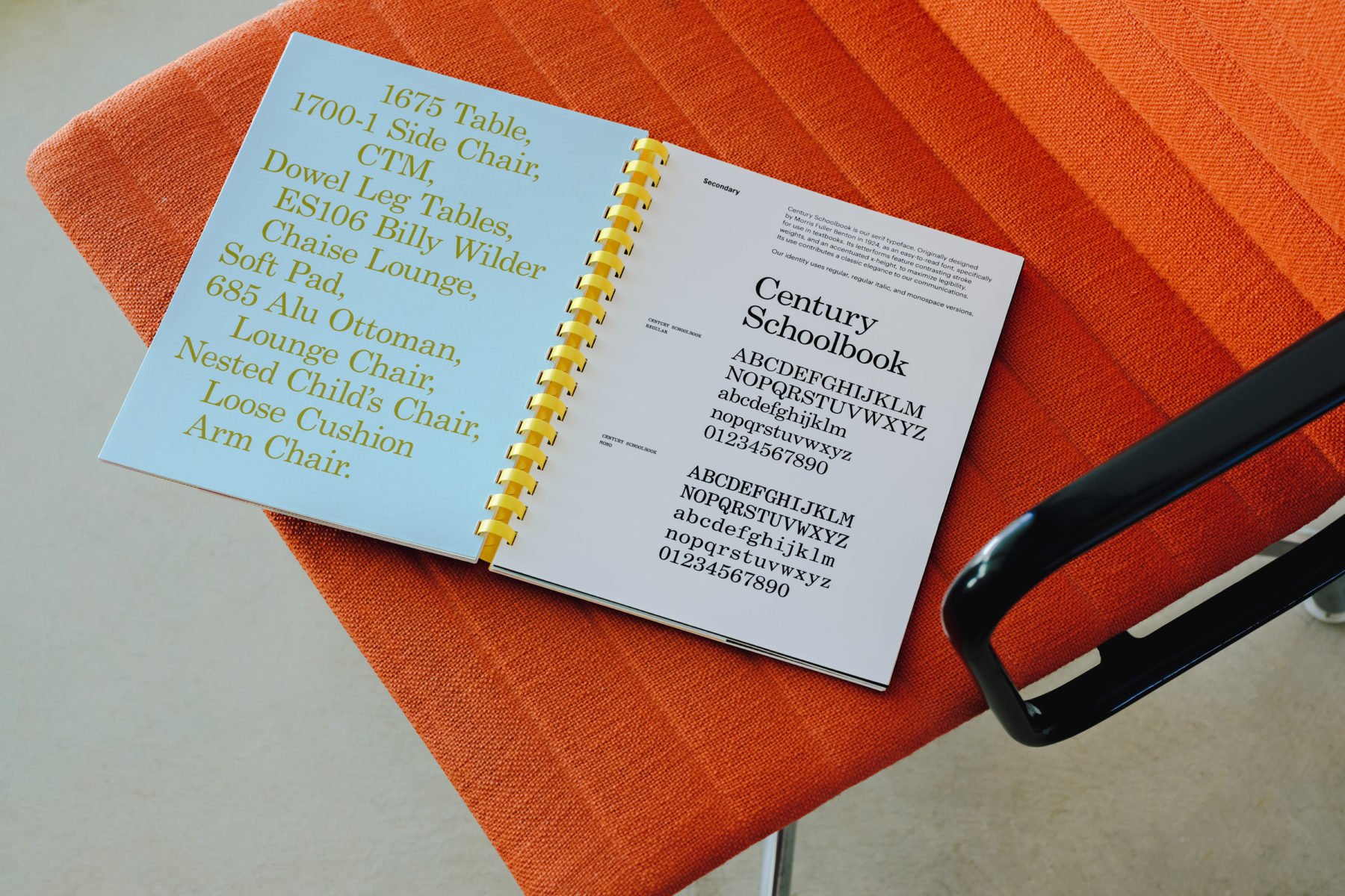
Topol Bold references News Gothic—a typeface that the Eames used in film titles, such as Powers of Ten. Its counterpart Century Schoolbook provides contrast and is used in ‘conversation’ with Topol, rooting the brand with a classic and timeless voice. Century Schoolbook Monospace references the archive labeling seen on the flat file drawers at the Eames Ranch and the Eameses’ very own business cards, while Graphik serves as a contemporary ‘workhorse’ sans serif.
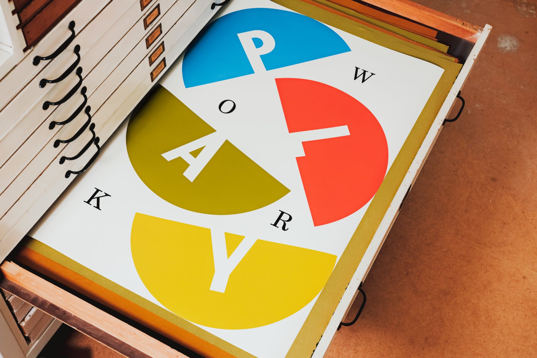

COLOR PALETTE
A rich color palette is drawn directly from the many graphic materials designed by the Eameses, while a flexible visual system brings life to the dynamic qualities of the organization and its editorial programming. The visual systems we developed have the flexibility to work across more functional settings—such as the digital experience—through to more experiential and tactile contexts, providing a sense of discovery, wonder, materiality, and play.
DIGITAL EXPERIENCE
The website, created by Instrument with curation and editorial content by the Eames Institute, invites visitors to discover how design has the power to change the world, through multiple entry points and ‘exhibits’.

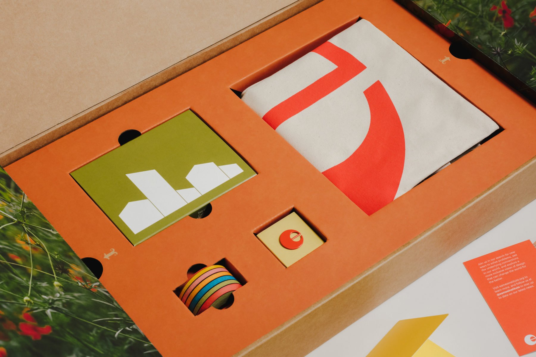
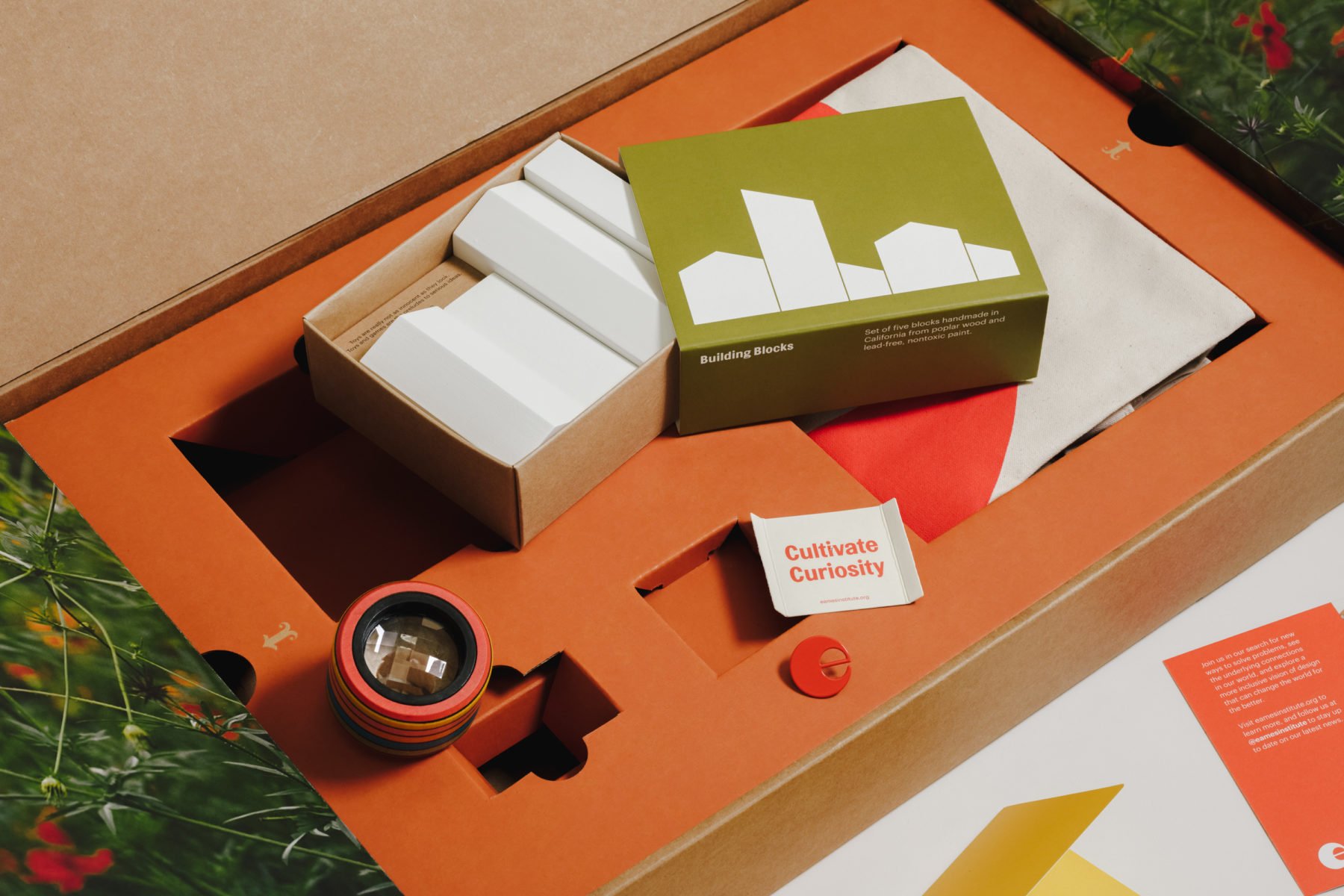
LAUNCH KIT
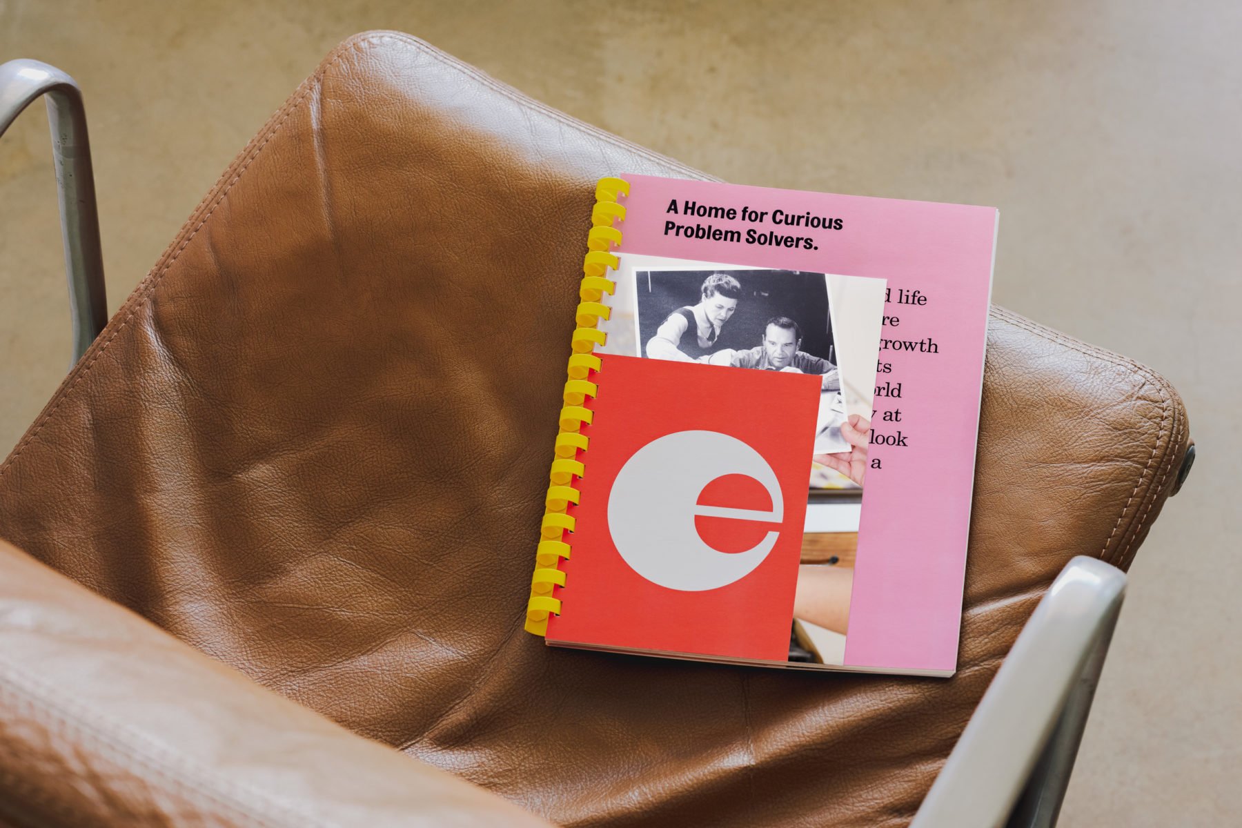
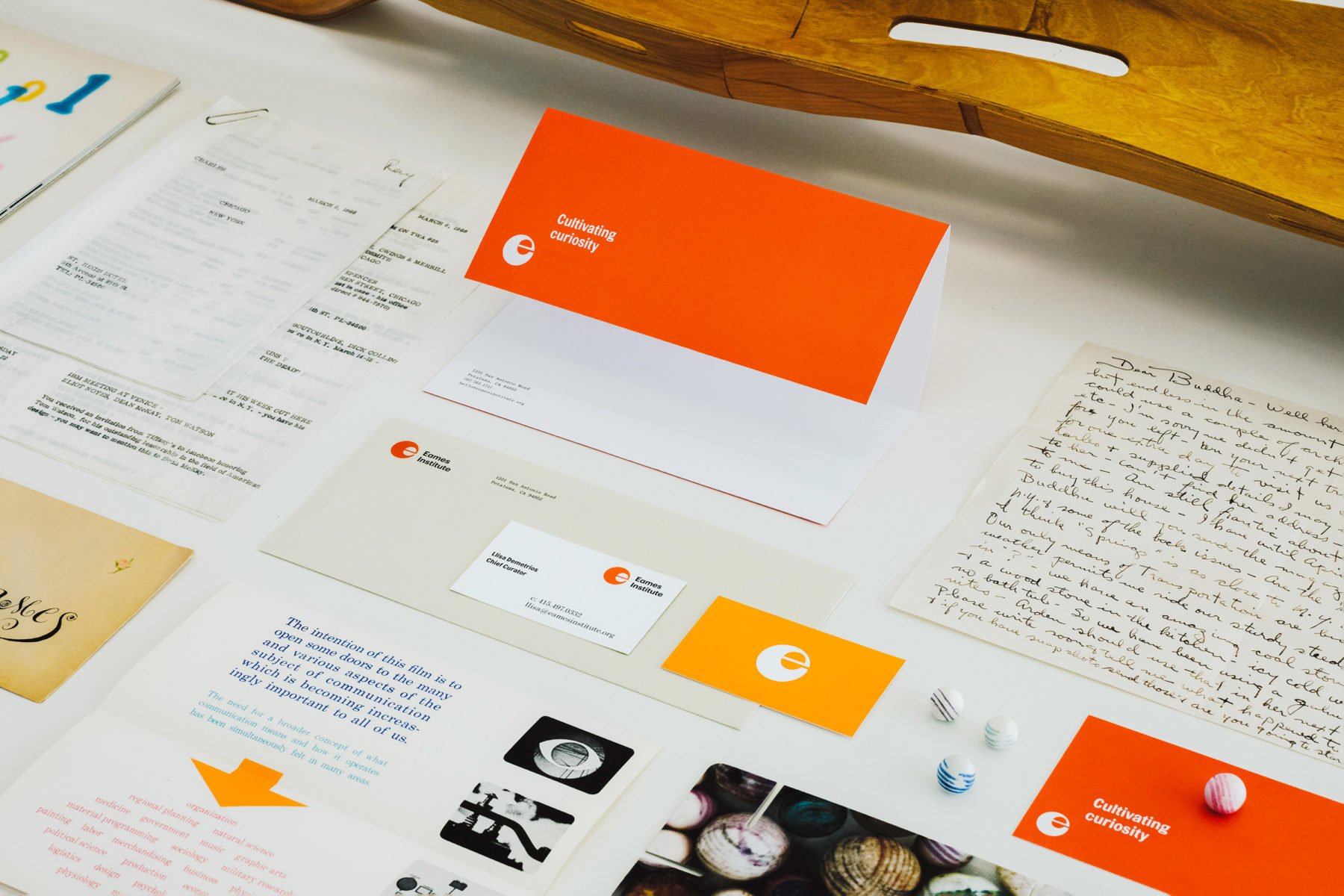
To compliment the launch of the institute’s digital experience, we designed and produced a celebratory ‘launch kit’—designed for, and gifted to, Eames Institute partners, friends, donors and media.

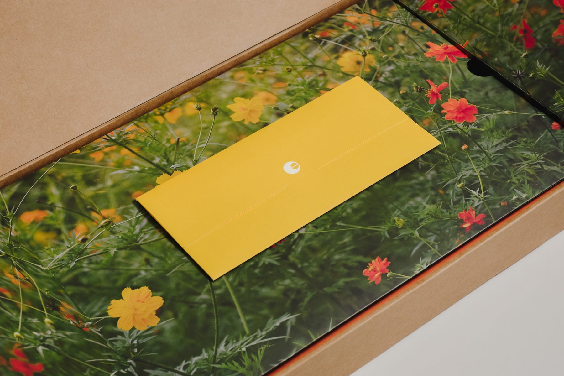

LAUNCH KIT
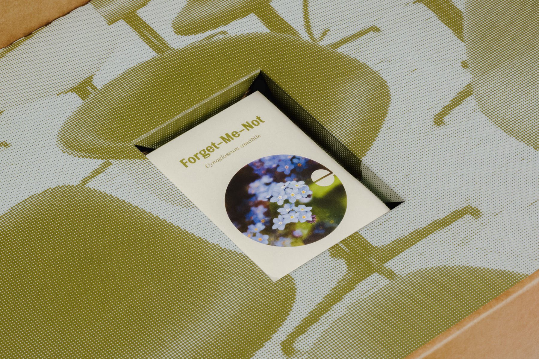
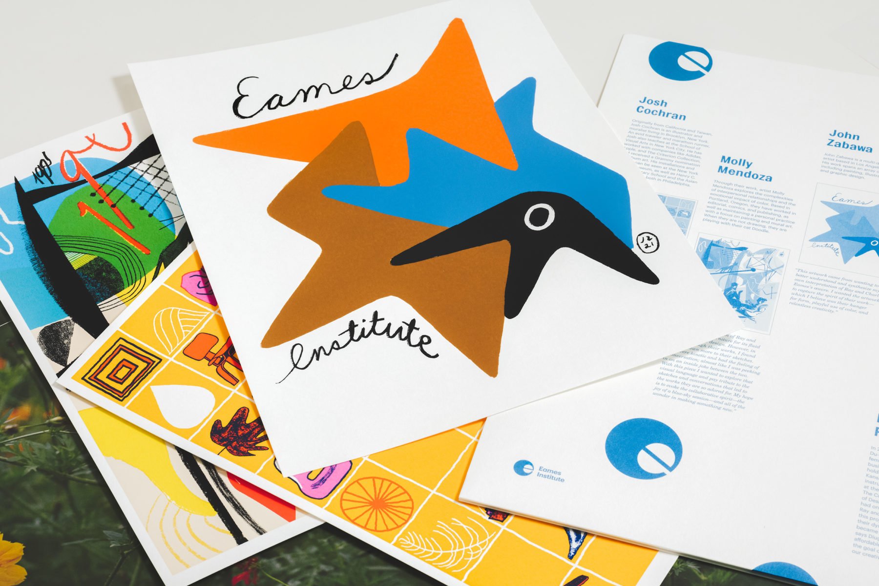
The kit invites users to discover the Eames Institute of infinite Curiosity through a series of prompts, communications, tactile experiences, and gifts, including limited edition commissioned artwork prints, Eames Ranch wooden blocks, a custom prism viewer, and a packet of Forget-me-not seeds—the flowers that Ray Eames used in the end scene of their Glimpses of the USA film in 1959.


DESIGN CREDITS
Agency: Manual
Creative Director: Tom Crabtree
Design Director: Frank Lionetti
Senior Art Director: Tanner Irwin
Senior Designer: Daniel Surgeon
Designer: Nathan Fyock
Designer: Phoebe Hsu
COLLABORATORS & CREDITS
Website: Instrument
Motion Graphics: Fionn Breen
Video: Farm League
Content & Editorial: Eames Institute
Eames Archive Photography: Nicholas Calcott
Case Study Photography: Mark Davis
Packaging Partners: Think Packaging, Stephen Gould
Illustration: Josh Cochran, Viktor Hachmang, Molly Mendoza, John Zabawa
PROJECT ROLE